


- Home
- Expert knowledge
- Green shades
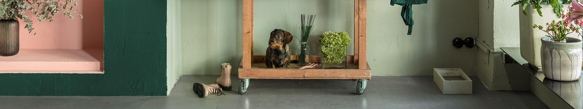
Naturally relaxed interiors with green tones
Is it high time for a new coat of paint? And you long for green? Before you can start painting, you can choose your personal favourite from what feels like an endless number of shades – which isn’t always easy. We will be happy to help you with the decision making process. Find out more about green as a relaxing or stimulating interior colour and its effect in the room. Inspiring sample designs show which shades of green work particularly well as a wall colour and which other colours they can be wonderfully combined with. You can also benefit from the helpful service Caparol offers for colour design.
This is how green works in rooms
Colour influences our spatial perception. It touches us emotionally – also unconsciously. Green is the colour we associate with nature and life. This also reflects the meaning of the word green. It comes from the Old High German verb "gruoen", which means something like grow, sprout and thrive.
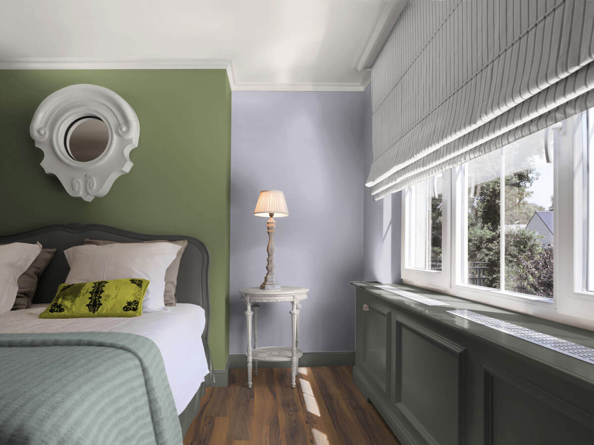
Due to the association with nature, gentle and natural green nuances have a calming aura. In this sense, a room designed according to nature can have a relaxing and revitalizing effect on our organisms. Strong shades of green have a stimulating and activating effect - yellowish green in particular is considered a source of creativity. Shades of green are therefore the first choice for rooms of relaxation and regeneration
For which rooms is green suitable?
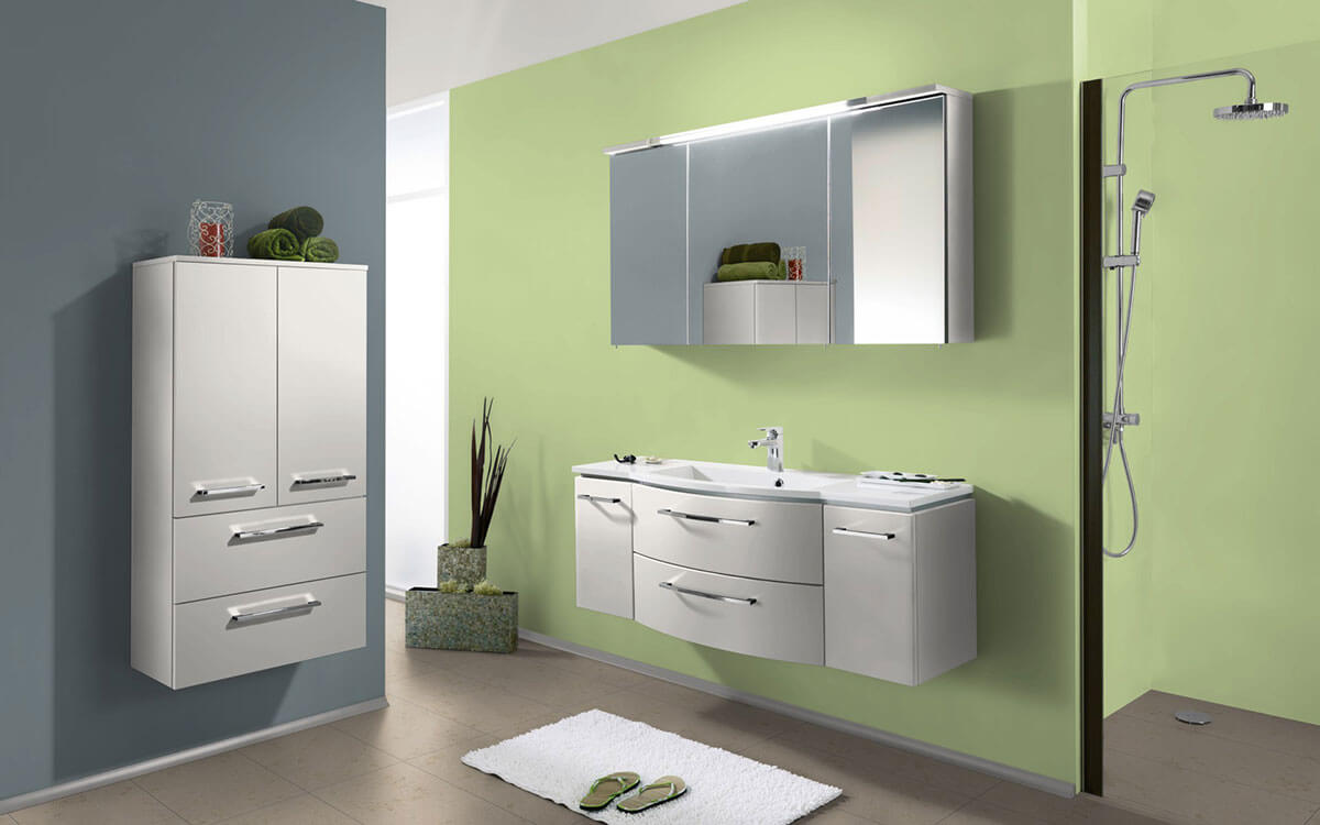
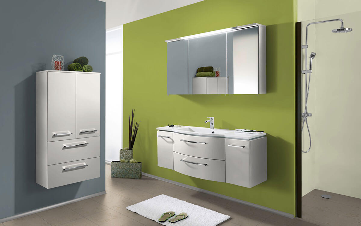
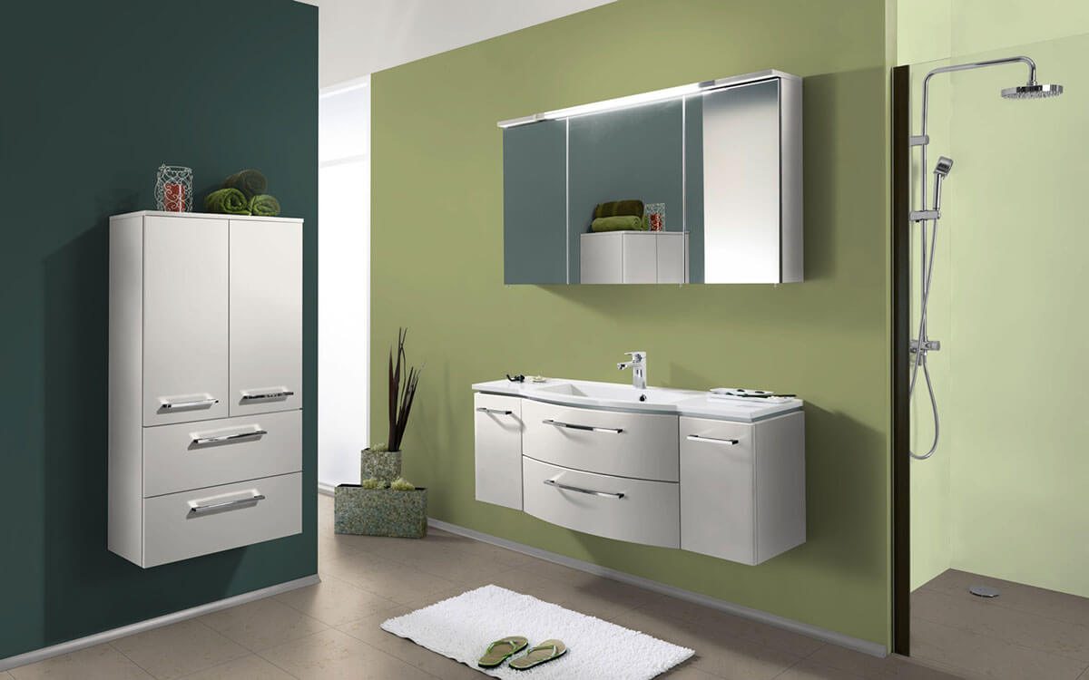
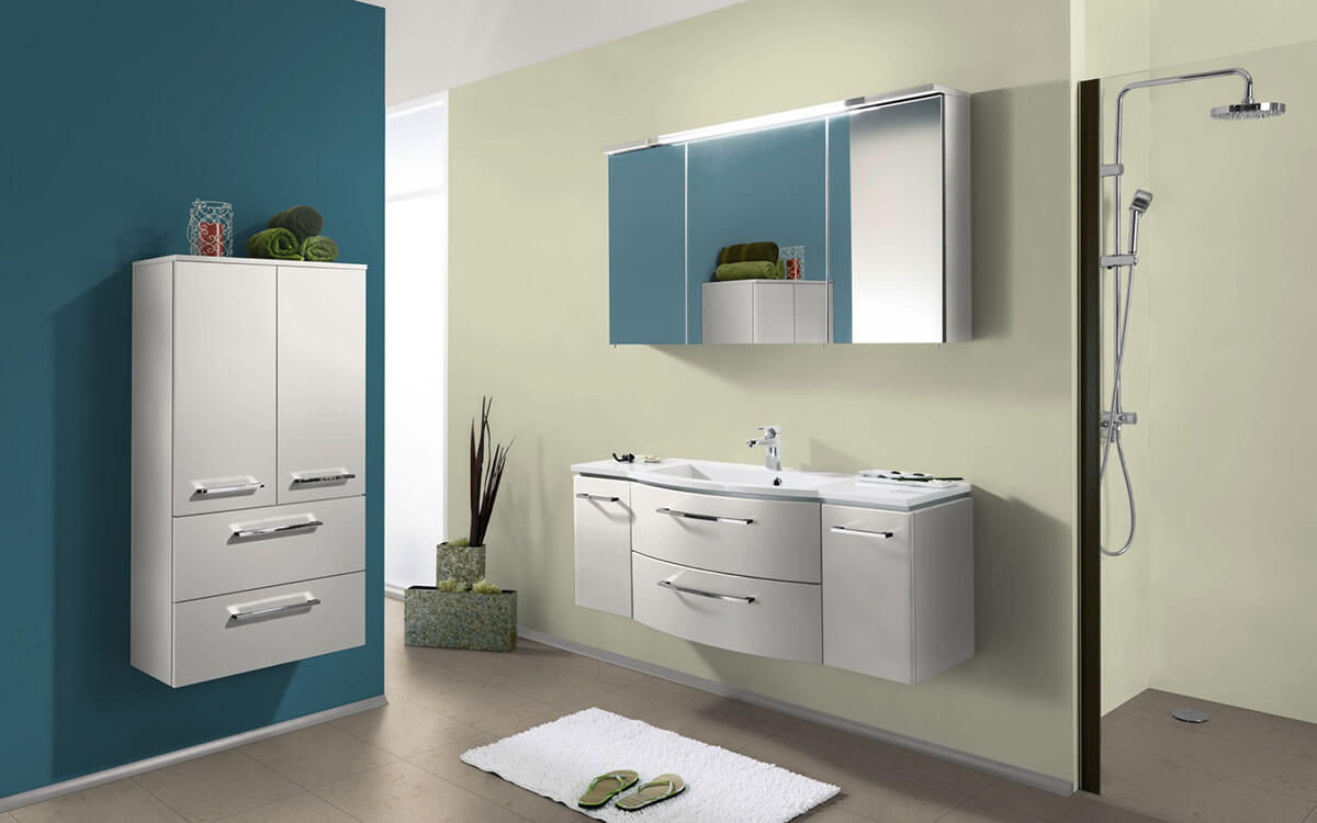
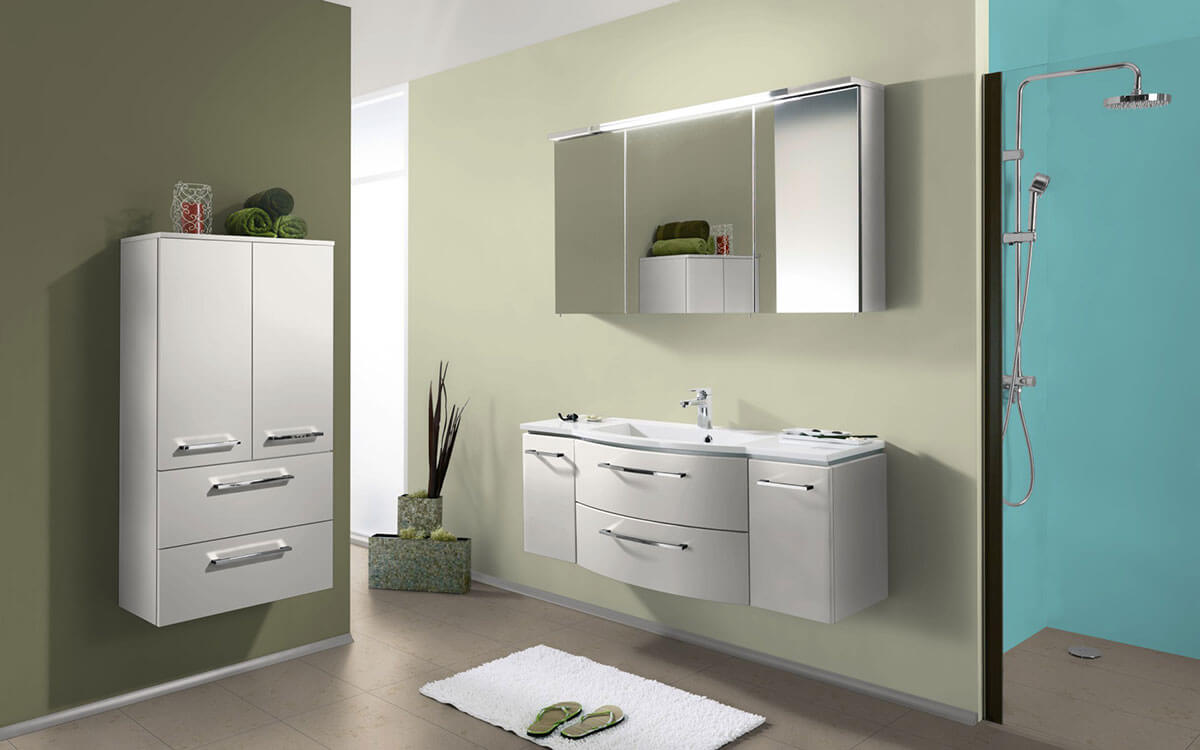
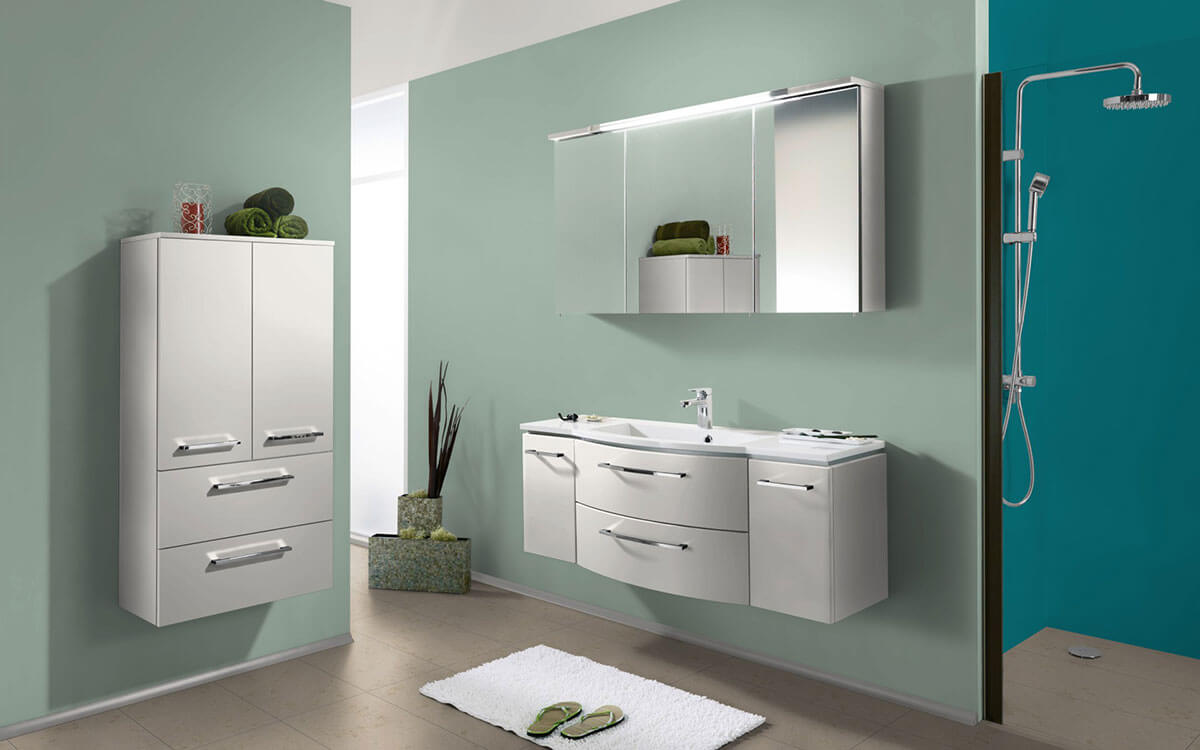
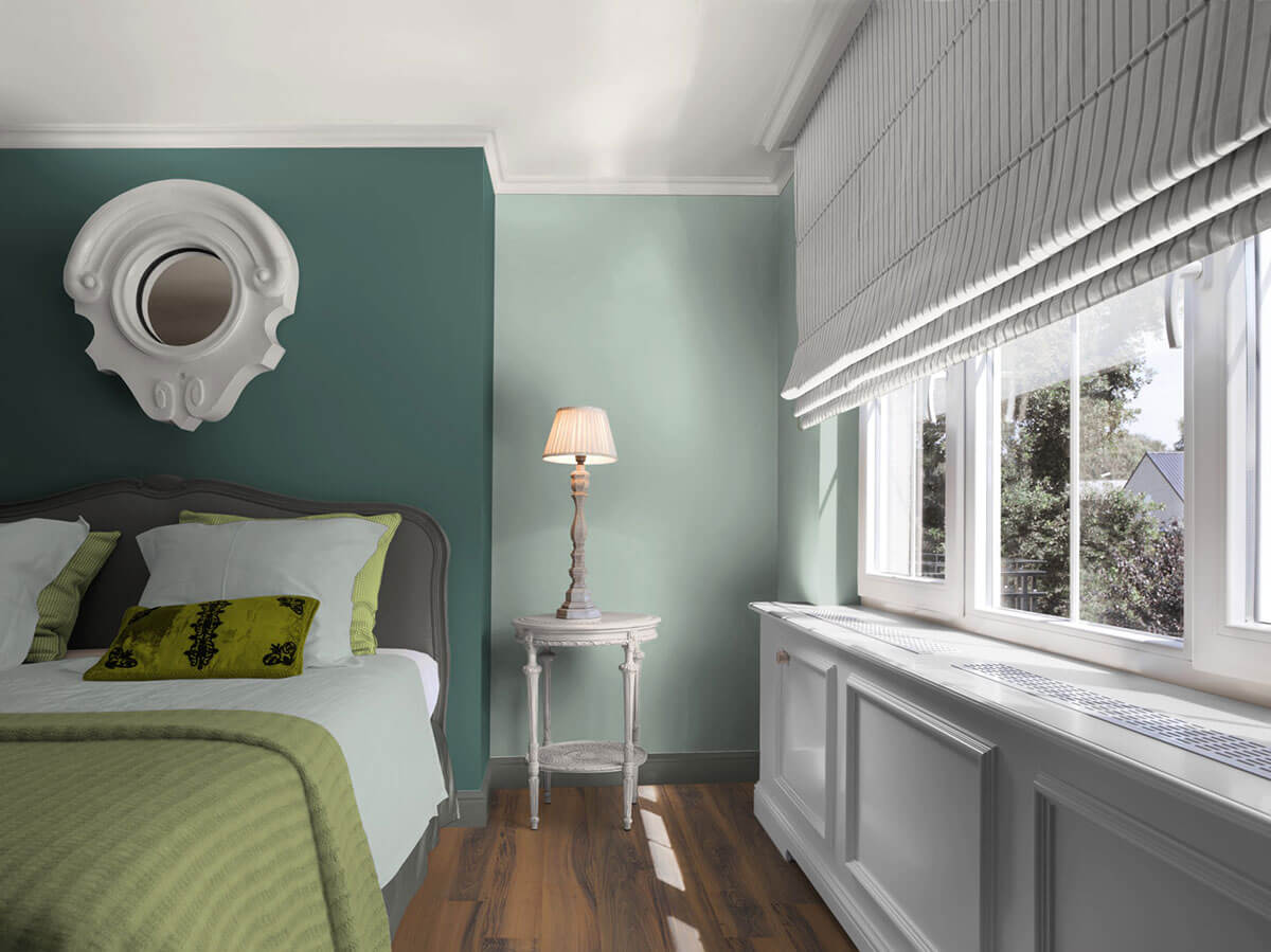
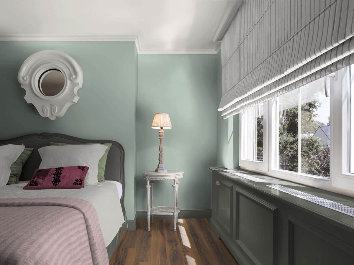
Due to its natural radiance, green wall paint is suitable for promoting calm, contemplation or creativity in certain rooms. It is therefore often painted in a wide variety of nuances to envelop the room or as an accent wall in bedrooms, guest rooms and studies. In windowless corridors, shades of green can evoke a glimpse of greenery and create a relaxed atmosphere.
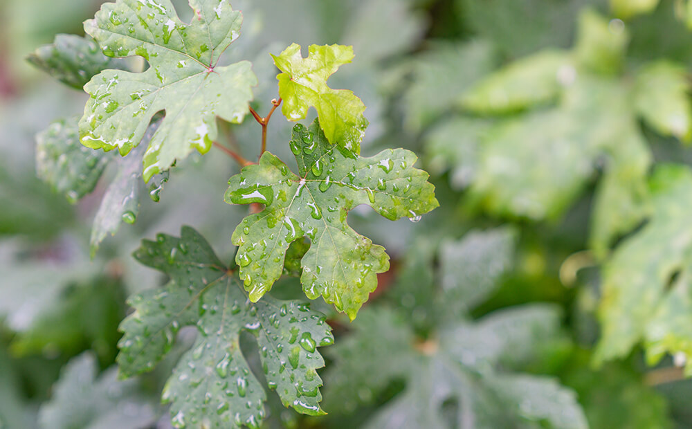
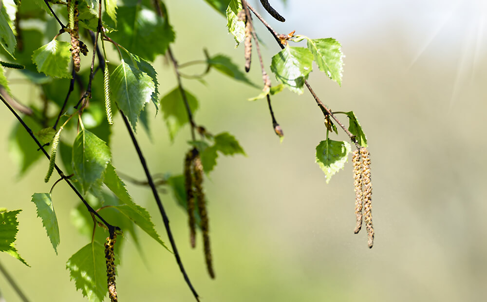
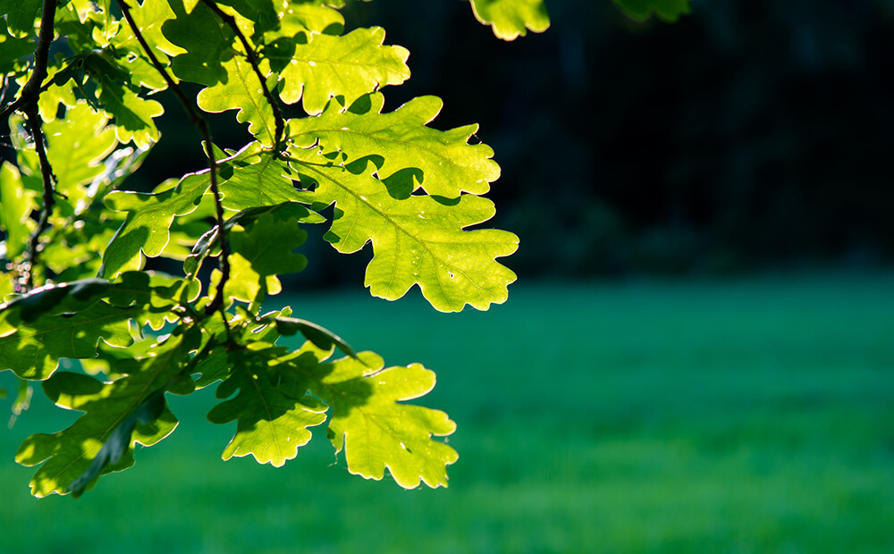
It's so green... there are many shades of green
Wall paint in green includes a wide range of different colour nuances that differ in brightness and luminosity. Let us take you on a journey of discovery through the colours of green nature. Many green names are self-explanatory because they are derived from plants or fruits, such as grass green, olive green, sage green, pistachio green, lime green, etc.
- Apple Green: a hue like a fresh green apple - eg a Granny Smith.
- Lime green: a light, soft, yellowish shade of green that gives rooms a cheerful appearance.
- Mint green: describes a bluish shade of green that is delicately pastel and bright for large wall areas and creates a fresh room atmosphere. Especially nice with reddish wooden furniture. Strongly saturated, he can set cheeky accents.
- Neon green: ideal for a small accent wall in the room: bright, eye-catching and bold - a retina scare.
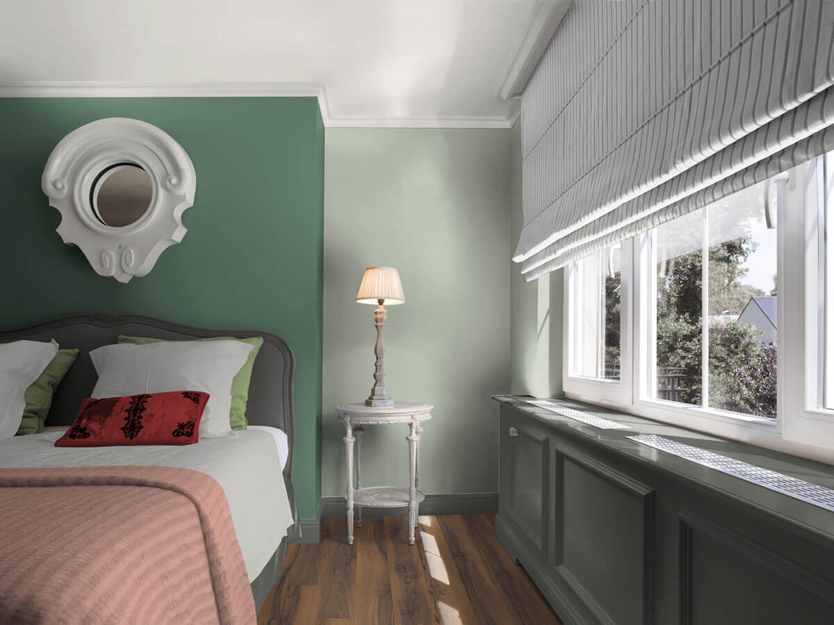
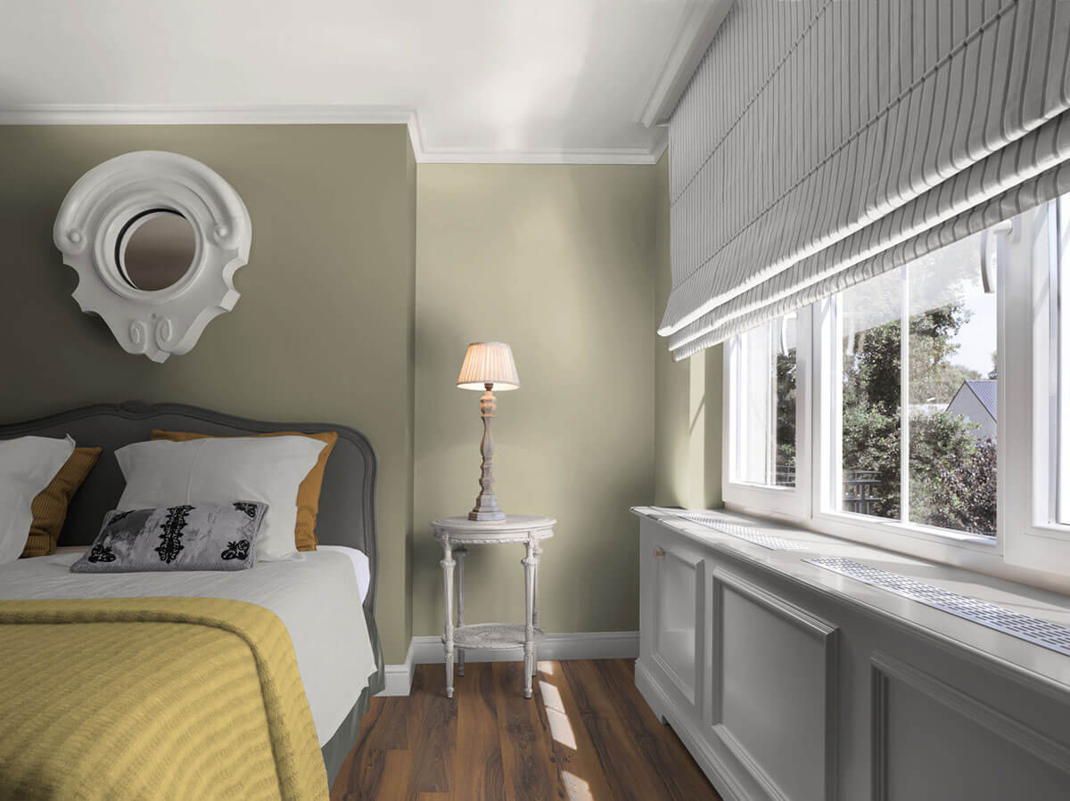
- Olive green: earthy, achromatic and darker shade of green that gives walls visual stability and exoticism. Attractive in combination with soft pastel tones such as rose, light turquoise or lavender blue.
- Pastel Green: Delicate and bright, clearly luminous or slightly veiled - if just a hint of colour is desired - yellowish or bluish possible.
- English Green - or British Racing Green - has its origins in England, where sports cars are often painted in dark shades of green.
- Hunter Green: Hunters wear green clothing as a camouflage colour to make them less visible to animals in the natural forest environment.
- Moss green: is a classic of rich, calm green tones for rooms with a natural look.
- Emerald green: Inspired by the gemstone emerald and therefore deeply saturated, dark colour - for a noble look.
- Fir green: refers to a wall colour that impresses with a dark, slightly bluish green and, like the fir trees in the forest, appears calm and static.
- Grass green: a rich, bright shade of green like a freshly mown lawn – recommended indoors as an accent wall for maximum refreshment.
What goes well with green?
The colour experts from Caparol created colour worlds around the trend colour 3D Patina 40 - a rich forest green, which was combined with related green nuances and other contrasting colour tones. Combinations with delicate rosé nuances from the complementary colour families grenadin, cameo and papaya are particularly exciting. Very calm room moods are created with luminous blue and cool grey blue.
Our service for you
It's definitely going to be green. But how exactly is still unclear? No problem. Caparol and its colour design studio are first class partners for colour and design expertise. The experienced team offers creative input and advises you individually.
If you have shortlisted one or more colours, the question of the effect under the respective lighting conditions in the room also arises. Our original colour shade sheets in the larger DIN A5 format are indispensable when deciding on a colour – they allow you to better assess the colour effect in the room. Tip: Hold the colour sample against the planned wall surface, both in daylight and with electric lighting, or at different times of the day. You can order every colour nuance of the Caparol colour fans online via our colour sheet dispatch service.
Do you already have your desired green as a sample? Then our ColorReaderPRO colour measuring device is ideal for determining the exact colour shade. The exact colour tone of your sample is determined in a matter of seconds and can then be mixed as a wall colour with our ColorExpress tinting service. Our mixing plants have over eight million colour formulations and are represented in specialist shops across Germany with over 6,000 locations.
Conclusion: Relaxed ambience with shades of green
- The green colour offers shades that are familiar to nature and therefore have a calming and friendly effect on us.
- Room design with green wall colours can definitely contribute to relaxation and promote creativity.
- The spectrum of green nuances is large and ranges from delicate yellowish or bluish nuances to rich accent colours and earthy olive tones.
- Green can be combined in many ways: Active yellowish green nuances create a lively contrast with calm grey or chocolate brown tones. Bluish fresh green tones harmonise particularly well with
warm-toned wood or white furniture. - Caparol offers an extensive range of interior paints for a wide range of requirements, which can be tinted in numerous shades of green.